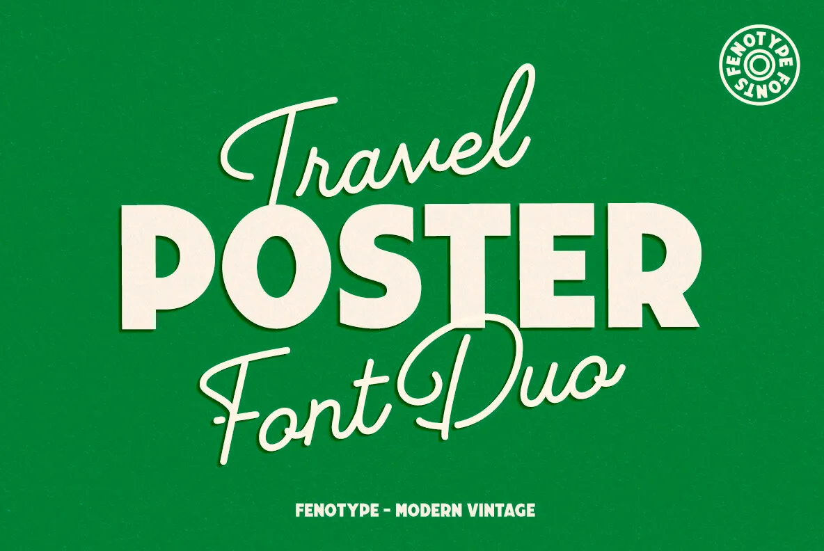
As a travel enthusiast, I have always been fascinated by the beauty of travel posters. Each font choice seems to encapsulate not just a destination but also the emotions tied to the adventures we embark on. From the sleek lines of modern typography to the vintage charm of retro fonts, travel poster fonts play a crucial role in branding destinations. This guide will delve into everything you need to know about travel poster fonts, their history, and how to choose the right one for your next project.
What Are Travel Poster Fonts?
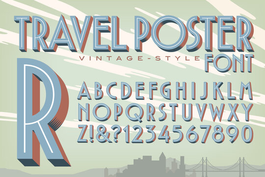
Travel poster fonts are typefaces specifically designed to evoke the spirit of travel. They often reflect the culture, history, and ambiance of various destinations. These fonts can be used in marketing materials, personal travel blogs, or even as art pieces for your home. Choosing the right travel poster font can enhance your visual storytelling and make your memories even more vibrant.
History of Travel Poster Fonts
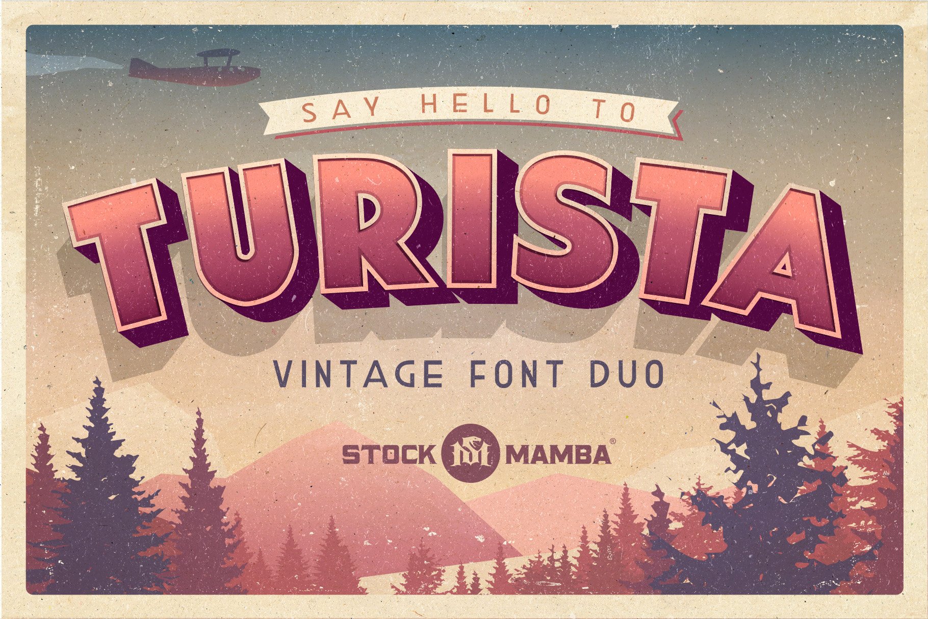
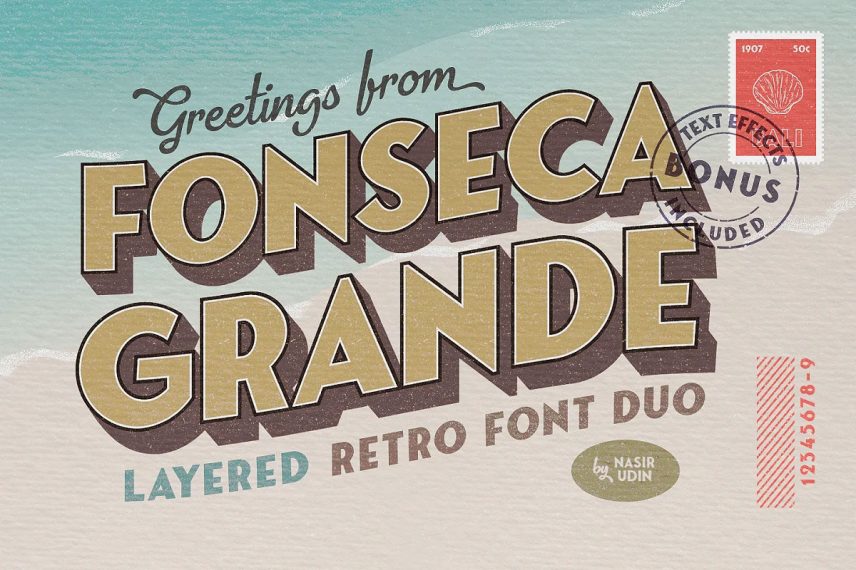
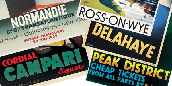
Travel posters have been around since the late 19th century, primarily promoting tourism. The fonts used in these posters evolved alongside graphic design trends. Early 20th-century posters often utilized Art Deco styles, which featured geometric shapes and bold lettering. This era laid the foundation for the modern travel poster aesthetic.
Influence of Art Movements
The choice of font in travel posters often reflects the prevailing art movements of the time:
- Art Nouveau: Flowing, organic designs with decorative lettering.
- Art Deco: Streamlined forms and bold typography, ideal for conveying a sense of luxury.
- Mid-Century Modern: Clean lines and minimalistic approach, perfect for evoking a sense of adventure.
Choosing the Right Travel Poster Font
Choosing the right font for your travel poster is crucial. Here are some factors to consider:
1. Destination Vibe
The font should match the personality of the location. For example, a laid-back beach vibe may call for a relaxed, flowing script, while a bustling city might benefit from a bold sans-serif font.
2. Readability
You want your audience to be able to read the text easily. Make sure the font is legible from a distance, especially for posters that may be viewed in crowded areas.
3. Color Compatibility
The font color should contrast well with the background. Often, travel posters combine bright colors that reflect the destination’s essence.
Top Travel Poster Fonts: A Comparison Table
| Font Name | Description | Use Case | Rating |
|---|---|---|---|
| Futura | A geometric sans-serif font with a modern feel. | City destinations, modern travel. | ⭐️⭐️⭐️⭐️⭐️ |
| Brush Script | Casual script typeface, ideal for laid-back vibes. | Beach or casual travel. | ⭐️⭐️⭐️⭐️ |
| Helvetica | A classic sans-serif font known for its clean lines. | Universal use in various travel contexts. | ⭐️⭐️⭐️⭐️⭐️ |
| Brandon Grotesque | A modern geometric sans-serif for a friendly touch. | Contemporary, appealing travel posters. | ⭐️⭐️⭐️⭐️ |
| Raleway | An elegant sans-serif font suitable for upscale travel. | Luxury destinations, fine dining. | ⭐️⭐️⭐️⭐️⭐️ |
Creating Your Own Travel Poster
Creating a travel poster can be an enjoyable experience. Here are some tips based on my personal journey:

1. Gather Inspiration
Before I designed my first travel poster, I explored countless designs for inspiration. Websites such as Pinterest and Behance offer a wealth of ideas. I even visited local art galleries to see how colors and fonts play together in different contexts.
2. Use Design Tools
Online tools like Canva, Adobe Illustrator, or even Procreate for iPad users are fantastic for creating your own posters. I particularly enjoyed using Canva for its user-friendly interface and a plethora of templates.
3. Experiment with Fonts
Try different combinations of fonts. I learned that pairing a bold font for the headline with a more subdued font for the body text can create a striking effect. Don’t be afraid to mix and match to see what resonates with you.
4. Seek Feedback
My design improved significantly after sharing with friends and family. Constructive criticism can help refine your work, ensuring it resonates with your intended audience.

Destination Highlights Through Typography
Let’s explore how typography enhances the allure of various destinations by diving into specific examples from my travels.
The Enchantment of Paris
Nothing says romance like Paris. The elegant script fonts that often adorn Parisian travel posters perfectly encapsulate the city’s charm. During my visit to Montmartre, I stumbled upon a quaint café whose menu was beautifully handwritten. It emphasized the city’s artistic spirit while enhancing the overall dining experience.
Font Recommendation: Didot
For Paris-themed designs, Didot is an exquisite choice. Its thin and thick contrasts mimic the city’s graceful architecture.
The Adventure of Bali
Bali’s vibrant culture calls for bold and playful fonts. While relaxing on the sandy beaches, I noticed numerous surf shops using charismatic typography that mirrored the fun and thrill of the island life.
Font Recommendation: Pacifico
For a Bali-inspired travel poster, Pacifico perfectly encapsulates the island’s laid-back yet adventurous spirit.
Pros and Cons of Popular Travel Poster Fonts
Futura
Pros:
- Modern and clean aesthetic.
- Highly versatile across various travel themes.
Cons:
- Could appear too sterile for some vintage-themed posters.
Brush Script
Pros:
- Casual and inviting feel.
- Great for beach or relax-themed designs.
Cons:
- May lack readability at smaller sizes.
Travel Tips for Aspiring Poster Designers
- Study Successful Posters: Analyze what makes popular travel posters effective.
- Stay True to Your Style: While it’s great to seek inspiration, infuse your personality into your designs.
- Have Fun: Enjoy the process! Create posters that inspire you and your audience.
Frequently Asked Questions (FAQs)
What tools can I use to create travel poster fonts?
You can use design tools like Adobe Illustrator, Canva, and Procreate to create stunning travel posters.
Are there free travel poster fonts available?
Yes, websites like Google Fonts and Font Squirrel offer a variety of free fonts suitable for travel poster design.
How can I ensure my travel poster stands out?
Ensure it combines unique imagery, an engaging font, and a cohesive color palette to draw attention.
Can I use travel poster fonts for commercial purposes?
Check the license of each font. Many free fonts have restrictions on commercial use, while others may require payment.
Final Thoughts
Travel poster fonts are not just about aesthetics; they are about telling a story and evoking emotions tied to our adventures. Through thoughtful selection and personal creativity, your travel posters can inspire countless wanderlust-filled souls.
As I reminisce about my travels and the posters that encapsulate those moments, I encourage you to explore various fonts and create memories that last a lifetime. Happy designing!